International phone number <input/> for React.
npm install react-phone-number-input --save
If you're not using a bundler then use a standalone version from a CDN.
The component requires two properties to be passed: value and onChange(value).
import 'react-phone-number-input/style.css'
import PhoneInput from 'react-phone-number-input'

return (
  <PhoneInput
    placeholder="Enter phone number"
    value={ this.state.phone }
    onChange={ phone => this.setState({ phone }) } />
)
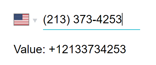
value will be the parsed phone number, e.g. if a user chooses "United States" and enters (213) 373-4253 then value will be +12133734253.
See the list of all available props for <PhoneInput/>. All other properties are passed through to the phone number <input/> component.
To format value back to a human-readable phone number use formatPhoneNumber(value) and formatPhoneNumberIntl(value) functions.
import { formatPhoneNumber, formatPhoneNumberIntl } from 'react-phone-number-input'

const value = '+12133734253'
formatPhoneNumber(value) === '(213) 373-4253' // National format
formatPhoneNumberIntl(value) === '+1 213 373 4253' // International formatThe styles for this React component must be included on a page too.
import 'react-phone-number-input/style.css'It is also recommended to set up something like a postcss-loader with a CSS autoprefixer for supporting old web browsers (e.g. > 1%).
Get the style.css file from this package, optionally process it with a CSS autoprefixer for supporting old web browsers (e.g. > 1%), and then include the CSS file on a page.
<head>
  <link rel="stylesheet" href="/css/react-phone-number-input/style.css"/>
</head>Country names translation can be passed via the labels property. E.g. labels={{ RU: 'Россия', US: 'США', ... }}. This component comes pre-packaged with a couple of ready-made translations. Submit pull requests for adding new translations.
import ru from 'react-phone-number-input/locale/ru'

<PhoneInput ... labels={ru}/>import { isValidPhoneNumber } from 'react-phone-number-input'
if (value) {
isValidPhoneNumber(value) // `true` or `false`
}This library comes pre-packaged with three flavors of metadata:
-
max— The complete metadata set, is about140 kilobytesin size (libphonenumber-js/metadata.full.json). -
min— (default) The smallest metadata set, is about75 kilobytesin size (libphonenumber-js/metadata.min.json). Doesn't contain regular expressions for advanced phone number validation. Some simple phone number validation still works (basic length check, etc), it's just that it's loose compared to the "advanced" validation (not so strict). -
mobile— The complete metadata set for dealing with mobile numbers only, is about105 kilobytesin size (libphonenumber-js/metadata.mobile.json).
To use a particular metadata set import the component from the relevant sub-package: react-phone-number-input/max, react-phone-number-input/min or react-phone-number-input/mobile.
Importing the component directly from react-phone-number-input results in using the min metadata which means loose (non-strict) phone number validation.
Sometimes (rarely) not all countries are needed and in those cases the developers may want to generate their own "custom" metadata set. For those cases there's react-phone-number-input/core sub-package which doesn't come pre-wired with any default metadata and instead accepts the metadata as a property.
I personally wouldn't use strict phone number validation in my projects because telephone numbering plans constantly evolve and validation rules do change over time which means isValidPhoneNumber() function may become outdated if a website isn't re-deployed regularly. Still, some people want this feature, so it's included.
If you think that the phone number parsing/formatting/validation engine malfunctions for a particular phone number then follow the bug reporting instructions in libphonenumber-js repo.
Make sure to put a <PhoneInput/> into a <form/> otherwise web-browser's "autocomplete" feature may not be working: a user will be selecting his phone number from the list but nothing will be happening.
One can supply their own country <select/> component in case the native one doesn't fit the app. See countrySelectComponent property.
For example, one may choose react-responsive-ui's <Select/> component over the native country <select/>.
import 'react-phone-number-input/style.css'

// Requires "CSS custom properties" support.
// For Internet Explorer use PostCSS with "CSS custom properties" plugin.
import 'react-responsive-ui/style.css'

// A `<PhoneInput/>` with custom `countrySelectComponent`.
import PhoneInput from 'react-phone-number-input/react-responsive-ui'

return (
  <PhoneInput
    placeholder="Enter phone number"
    value={ this.state.phone }
    onChange={ phone => this.setState({ phone }) } />
)Some people requested an exported minimal phone number input component without country <select/>.
import PhoneInput from `react-phone-number-input/basic-input`

class Example extends Component {
  state = {
    value: ''
  }

  render() {
    // If `country` property is not passed
    // then "International" format is used.
    return (
      <PhoneInput
        country="US"
        value={ this.state.value }
        onChange={ value => this.setState({ value }) } />
    )
  }
}There's nothing special about a phone number extension input: it doesn't need any formatting, it can just be a simple <input type="number"/>. Still, some users kept asking for a phone number extension input feature. So I added a basic phone number extension input support. It can be activated by passing ext property (a React.Element, see the demo).
import React, { Component } from 'react'
import { Field, reduxForm } from 'redux-form'
import PhoneInput from 'react-phone-number-input'

class Form extends Component {
  render() {
    const ext = (
      <input
        value={ ... }
        onChange={ ... }
        type="number"
        noValidate />
    )

    return (
      <form onSubmit={ ... }>
        <PhoneInput
          value={ ... }
          onChange={ ... }
          ext={ ext } />

        <button type="submit">
          Submit
        </button>
      </form>
    );
  }
}
In a real-world application the ext property is most likely gonna be a "form field", e.g. an easy-react-form <Field/>, or a redux-form <Field/>, or a react-final-form <Field/>.
Phone number extension input will appear to the right of the phone number input. One can always skip using the ext property and add a completely separate form field for phone number extension input instead.
{ number, ext } object can be converted to an RFC3966 string for storing it in a database.
import { formatRFC3966 } from 'react-phone-number-input/libphonenumber'

formatRFC3966({ number: '+12133734253', ext: '123' })
// 'tel:+12133734253;ext=123'
Use the accompanying parseRFC3966() function to convert an RFC3966 string into an object having shape { number, ext }.
import { parseRFC3966 } from 'react-phone-number-input/libphonenumber'

parseRFC3966('tel:+12133734253;ext=123')
// { number: '+12133734253', ext: '123' }The <PhoneInput/> component accepts some customization properties:
-
metadata— Customlibphonenumber-jsmetadata. -
labels— Custom translation (including country names). -
internationalIcon— Custom "International" icon. -
inputComponent— Custom phone number<input/>component. -
countrySelectComponent— Custom country<select/>component.
import PhoneInput from 'react-phone-number-input/core'

import labels from 'react-phone-number-input/locale/ru'
import metadata from 'libphonenumber-js/metadata.min.json'
import InternationalIcon from 'react-phone-number-input/international-icon'

<PhoneInput
  inputComponent={...}
  countrySelectComponent={...}
  labels={labels}
  metadata={metadata}
  internationalIcon={InternationalIcon}/>
All these customization properties have their default values. If some of those default values are not used, and the developer wants to reduce the bundle size a bit, then he can use the /core export instead of the default export to import a <PhoneInput/> component which doesn't include any of the default customization properties. In this case all customization properties must be passed.
import PhoneInput from 'react-phone-number-input/core'React component for the country select. See CountrySelectNative and CountrySelectReactResponsiveUI for an example.
Receives properties:
name : string?— HTMLnameattribute.value : string?— The currently selected country code.onChange(value : string?)— Updates thevalue.onFocus()— Is used to toggle the--focusCSS class.onBlur()— Is used to toggle the--focusCSS class.options : object[]— The list of all selectable countries (including "International") each being an object of shape{ value : string?, label : string, icon : React.Component }.disabled : boolean?— HTMLdisabledattribute.tabIndex : (number|string)?— HTMLtabIndexattribute.className : string— CSS class name.
React component for the phone number input field. See InputSmart and InputBasic for an example.
Receives properties:
value : string— The parsed phone number. E.g.:"","+","+123","123".onChange(value : string)— Updates thevalue.onFocus()— Is used to toggle the--focusCSS class.onBlur()— Is used to toggle the--focusCSS class.country : string?— The currently selected country.undefinedmeans "International" (no country selected).metadata : object—libphonenumber-jsmetadata.- All other properties should be passed through to the underlying
<input/>.
Must also implement .focus() method.
Since this is a React component initially I thought that including all country flags in SVG format would be the best way to go. But then it turned out that when bundled all those country flags would take an extra 3 megabytes which is obviously not an option for a website (though it might be an option for an "internal" web application, or a desktop application built with Electron, or a mobile app).
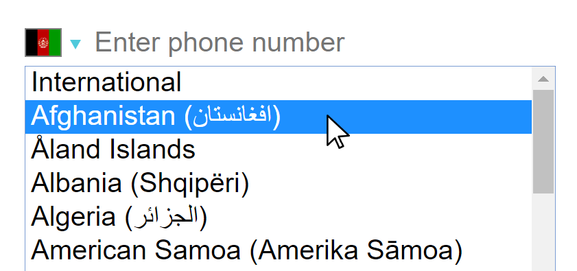
So, including all country flags in SVG format in the javascript bundle wouldn't be an option, and so all country flags are included as <img src="..."/> instead (by default the src points to flag-icon-css repo GitHub pages). And when using the (default) native country <select/> only the selected country flag icon is displayed therefore reducing the footprint to the minimum.
For the same reasons the custom react-responsive-ui country <select/> doesn't show all country flag icons when expanded: otherwise the user would have to download all those flag icons when the country <select/> is expanded.
To use the SVG country flags (3 megabytes):
import PhoneInput from 'react-phone-number-input'
import flags from 'react-phone-number-input/flags'

<PhoneInput flags={flags} .../>One can use any npm CDN service, e.g. unpkg.com or jsdelivr.net
<!-- `libphonenumber-js` (is used internally by `react-phone-number-input`). -->
<script src="https://unpkg.com/[email protected]/bundle/libphonenumber-js.min.js"></script>

<!-- Either `react-phone-number-input` with "native" country `<select/>`. -->
<script src="https://unpkg.com/[email protected]/bundle/react-phone-number-input-native.js"></script>

<!-- Or `react-phone-number-input` with `react-responsive-ui` `<Select/>`. -->
<script src="https://unpkg.com/[email protected]/bundle/react-phone-number-input-react-responsive-ui.js"></script>

<!-- Styles for the component. -->
<link rel="stylesheet" href="https://unpkg.com/[email protected]/bundle/style.css"/>

<!-- Styles for `react-responsive-ui` `<Select/> -->
<!-- (only if `react-responsive-ui` `<Select/>` is used). -->
<link rel="stylesheet" href="https://unpkg.com/[email protected]/bundle/style.css"/>

<script>
  var PhoneInput = window['react-phone-number-input']
</script>React Responsive UI component library.


