-
Notifications
You must be signed in to change notification settings - Fork 3
Map controls
This section describes how to customize marker's pin image.
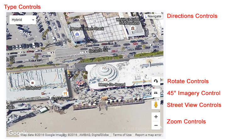
The following image shows position and appearance of map controls that could be activated in the widget:

The Zoom control displays "+" and "-" buttons for changing the zoom level of the map. This control appears by default in the bottom right corner of the map.
The Street View control contains a Pegman icon which can be dragged onto the map to enable Street View. This control appears by default near the bottom right of the map.
The Google Maps API supports special 45° imagery for certain locations. This high-resolution imagery provides perspective views towards each of the cardinal direction (North, South, East, West). These images are available at higher zoom levels for supported map types (satellite maps) at supported locations. An example of location is the boardwalk in Santa Cruz, CA.
The Rotate control provides a combination of tilt and rotate options for maps containing oblique imagery. This control appears by default near the bottom right of the map.
By default, both controls' presence is determined by the presence or absence of 45° imagery for the given map type at the current zoom and location. You may alter the control's behavior and disable their appearance. However, you cannot make the control appear if no 45° imagery is currently available.
The directions control appears as a button in the top right corner of the map. When the user clicks this button, a new Google Maps window opens for navigation and routing. You can set a text that will be displayed on the button.
The Map Type control lets the user toggle between map types (such as Map and Satellite - read more). The 'Styled' type is a map that is customized in the 'Styles' settings section of the widget. By default, this control appears in the top left corner of the map.
You can define the list of map types that will show in the map's type controls. Google displays maximum first 3 map types.
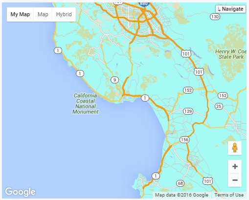
The appearance of the type controls can be configured. The controls can show as buttons in a horizontal bar or a single button control allowing you to select the map type via a dropdown menu. The default behavior means that the optimal visual style is chosen depending on the screen size.
Example of horizontal bar appearance:

The Scale control provides a simple map scale. When enabled, it will always appear in the bottom right corner of the map.