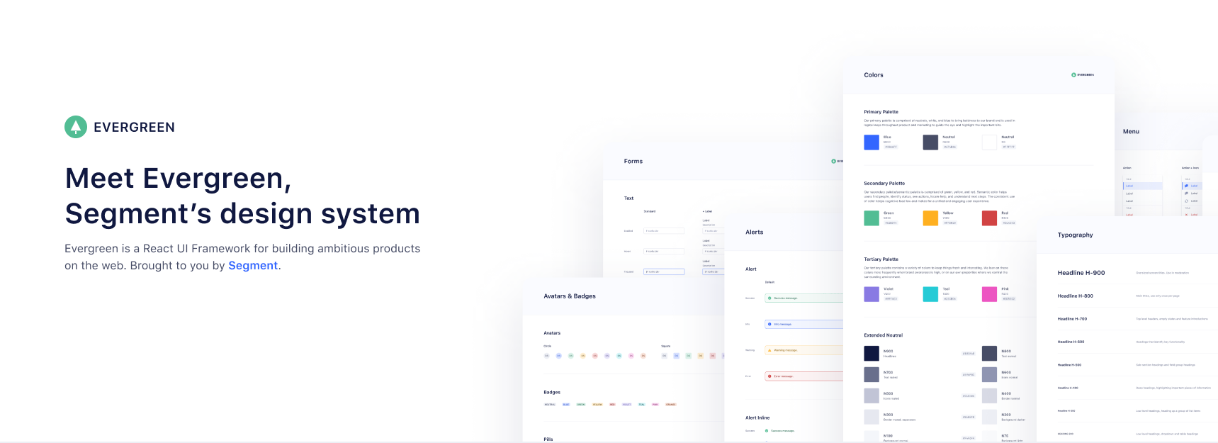
- Evergreen v4 coming soon
- Prerelease:
yarn add evergreen-ui@next - View PR
- View v4 Documentation (WIP)
- Prerelease:
- React 16
- Documentation (WIP)
- View Live Storybook
- Presentational React components
- Powerful component API with ui-box
- Dedicated UI Development Environment with React storybook
- Easy adoption because of CSS-in-JS
- Easy Server Side Rendering (SSR) and automatic hydration
- Interested in Evergreen? Come work for Segment!
- Brought to you by Segment
Evergreen is built on the belief that you can never predict all future requirements, only prepare for it. Instead of creating fixed configurations that work today, Evergreen promotes building systems that anticipate new and changing design requirements.
Evergreen is built on the belief that things should work out of the box with smart defaults, but also offer full control when needed. For example, Evergreen uses CSS-in-JS and builds on top of the Box component in ui-box.
Evergreen is built on the belief that using Evergreen and contributing to Evergreen should be a pleasant experience. We prioritize documentation and all the tools for a solid developer experience. We advocate respect and inclusivity in our writings and interactions.
🌲 Evergreen is made up of multiple components and tools which you can import one by one. All you need to do is install the evergreen-ui package:
$ yarn add evergreen-ui
# or
$ npm install --save evergreen-ui
A working version, assuming you are using something like Create React App, might look like this:
import React from 'react'
import ReactDOM from 'react-dom'
import { Button } from 'evergreen-ui'

ReactDOM.render(
  <Button>I am using 🌲 Evergreen!</Button>,
  document.getElementById('root')
)Evergreen currently does not support theming.
This project is originally build to support the development of product at Segment. This is also the reason theming is not our short term priority. It is on our longer term priority list and hopefully will be supported later in 2018. Expect a clearer roadmap available before that.
Learn more about the theming roadmap
Evergreen bundles 2 CSS-in-JS solutions, from glamor and ui-box. To make it super easy to do server side rendering and hydration, Evergreen exposes a extractStyles() function that will do SSR for both at once.
- How to use it with Next.js in the ssr-next example app.
- How to use it with GatsbyJS
If you are using Atom, make sure to install the prettier-atom, linter and linter-xo packages.
All the configuration for prettier and xo is in the package.json.
You shouldn't have to configure things separately, please file a issue if there's a problem.
To actually start seeing the components you have to run React Storybook:
$ yarn dev
Please take a look at the contributing guide and roadmap to better understand what to work on.
Inside the package.json there are a bunch of scripts that this repo uses
to run the project in development and to build the project.
Below you can read a description of each script.
Starts the development React Storybook.
Lints the JavaScript files using XO and then runs the unit tests using AVA.
Builds all of the JavaScript files using Babel.
Removes all untracked files (git clean -Xdf).
Releases new version of Evergreen (requires np to be installed globally).
This command scaffolds a package with no specific boilerplate. It's useful for creating utilities.
For the following command:
yarn create-package utils
The following file tree will be generated:
/src/utils
├── /src/
└── index.js
This command scaffolds a package with React component(s) boilerplate. You can pass one or more components to this command.
For the following command:
yarn create-package:components typography Text Heading
The following file tree will be generated:
/src/typography
├── /src/
|   │── Text.js
|   └── Heading.js
├── /stories/
│   └── index.stories.js
└── index.js
For the following command:
$ yarn run create-docs-template layers Pane Card
The following file tree will be generated:
/src/layers/docs
├── index.js
└── /examples/
    ├── Pane-basic.example
    └── Card-basic.example
This yarn run create-docs-template script is far from perfect and still requires manual steps. This includes:
- Making sure to use the right examples and write some docs.
- Configure
docs/utils/getComponent.js - Configure
docs/components/ComponentsSidebar.js
We will add you to the list if you make any contribution!
- Jeroen Ransijn
- Roland Warmerdam
This project is maintained by Segment
Please take a look at the contributing guide and roadmap to better understand what to work on.
Please respect our Code of Conduct, in short:
- Using welcoming and inclusive language
- Being respectful of differing viewpoints and experiences
- Gracefully accepting constructive criticism
- Focusing on what is best for the community
- Showing empathy towards other community members
Evergreen is released under the MIT license.
Copyright © 2017 Segment.io, Inc.
