-
Notifications
You must be signed in to change notification settings - Fork 0
Spatial
“Knowing where things are, and why, is essential to rational decision making”
Jack Dangermond, Environmental Systems Research Institute (ESRI)
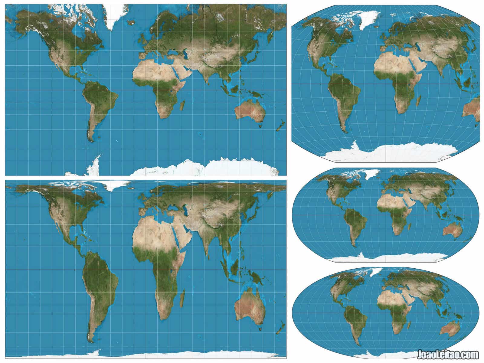
The world is not flat but is ballish. We go out an make measurements on this ballish shape, and then we bring home our data and we want to make sense of it. So we dig out our pencils and papers and flat screens and try to draw the ballish data on a flat surface; which is called projection. It turns out that are many ways to make that happen and all of them require some math.
 Map projections example from https://www.joaoleitao.com
Modern programming languages provide tools for managing spatially located data so that we mortals can do our work with a lot less math. Phew!
In R-language there are at least two common sets of tools, of which we have chosen one, Simple Features. The sf and stars R packages are our go-to tools in this project.
We have made it quite easy to read in spatial data, so we’ll just read
them in quickly: We’ll read in points (buoys), linestrings/polygons
(coast) and environemental covariates (covars) for RCP8.5 in 2075.
buoys = gom_buoys()
coast = read_coastline()
db = brickman_database() |>
  dplyr::filter(scenario == "RCP85",
                year == 2075,
                interval == "mon")
covars = read_brickman(db)R has a number of different graphing/plotting systems so we have to make
a choices. Here we choose two paths: base
graphics and
ggplot2.
Generally we use base graphics with spatial data, but sometimes we need
the power of ggplot2, so below we present the two systems showing the
same plots.
If you need a ggplot2 refresher be sure to checkout the tabular data tutorial.
Here we plot the coastline and then add the buoys. Not that we request axes, that the coast be colored orange, and that the graphics does not get reset so that we can add other items. We also make the buoy points big and green
plot(coast, col = "orange", axes = TRUE, reset = FALSE)
plot(buoys, col = "green", pch = 20, cex = 2, add = TRUE)
## Warning in plot.sf(buoys, col = "green", pch = 20, cex = 2, add = TRUE):
## ignoring all but the first attribute
 Note that the extent
of the map is set by the extent of the coastline data. We can override
that by providing a spatial object the defines a new extent. In this
case we can use the buoys themselves.
plot(coast, col = "orange", axes = TRUE, reset = FALSE, extent = buoys)
plot(buoys, col = "green", pch = 20, cex = 2, add = TRUE)
## Warning in plot.sf(buoys, col = "green", pch = 20, cex = 2, add = TRUE):
## ignoring all but the first attribute

Or we could simply reverse the order we plot. Note that we have to use
the add = TRUE when using plot after the first call to plot.
plot(buoys["id"], col = "green", pch = 20, cex = 2, axes = TRUE, reset = FALSE)
plot(coast, col = "orange", add = TRUE)
Here we start with the buoys, then we request that the buoys get
colored, and finally we add the coastline. You can see that the graphics
have a strong aethetic appeal compared to base graphics. That appeal is
why some folks use ggplot2 exclusively.
ggplot() +
  geom_sf(data = buoys,
          mapping = aes(color = id)) +
  geom_sf(data = coast,
          color = "orange")
But how to trim the extent to match just the buoy locations? There is no
comaprable argument to base graphic’s extent argument. The answer is
to crop the
coast to the extent of the buoys. This introduces onn of the many
“space-time” functions for sf and stars that all start with the
prefix st_. Below we crop the coast on the fly.
ggplot() +
  geom_sf(data = buoys,
          mapping = aes(color = id)) +
  geom_sf(data = st_crop(coast, buoys),
          color = "orange")
Here we can draw a single array, with the coastline and buoys on top.
It’s important not that if you draw an array it will completely cover
anyhting drawn before, so usually we draw the array first and draw stuff
on top of that. Note that we want to plot just one month of one variable
in the covars object. We select the variable in covars by subsetting
with covars["variable_name"], then we follow by with a slice to get
the month we want. Then we simple add the coast and points. Let’s do
September SST. Note that we use the reset and add arguments.
plot(covars['SST'] |> slice("month", "Sep"),
     axes = TRUE, reset = FALSE)
plot(coast, col = "orange", add = TRUE)
plot(buoys['id'], col = "purple", cex = 2, pch = 10, add = TRUE)
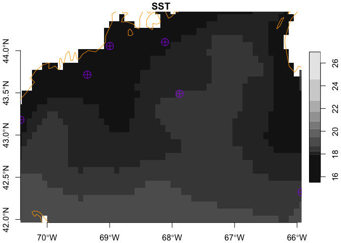
You might be wondering (or not!) if it is possible to use the extent
argument to “zoom” in on the buoy locations. Yep!
plot(covars['SST'] |> slice("month", "Sep"),
     axes = TRUE, reset = FALSE, extent = buoys)
plot(coast, col = "orange", add = TRUE)
plot(buoys['id'], col = "purple", cex = 2, pch = 10, add = TRUE)
Here we plot the same data, but note that we slip the array in first (so it doesn’t cover the rest of the stuff).
ggplot() +
  geom_stars(data = covars['SST'] |> slice("month", "Sep")) +
  geom_sf(data = buoys,
          mapping = aes(color = id)) +
  geom_sf(data = coast,
          color = "orange")
How about zooming in on the buoys? That requires 2 calls to st_crop:
one for the array and one for the coast. BUT, we want to crop not to
each buoy (which would leave use with very few array cells with data),
but rather to the bounding box of the buoys. It’s a subtle and important
difference.
buoy_box = st_bbox(buoys)
ggplot() +
  geom_stars(data = covars['SST'] |> slice("month", "Sep") |> st_crop(buoy_box)) +
  geom_sf(data = buoys,
          mapping = aes(color = id)) +
  geom_sf(data = st_crop(coast, buoy_box),
          color = "orange")