-
Beta Was this translation helpful? Give feedback.
Replies: 3 comments 4 replies
-
|
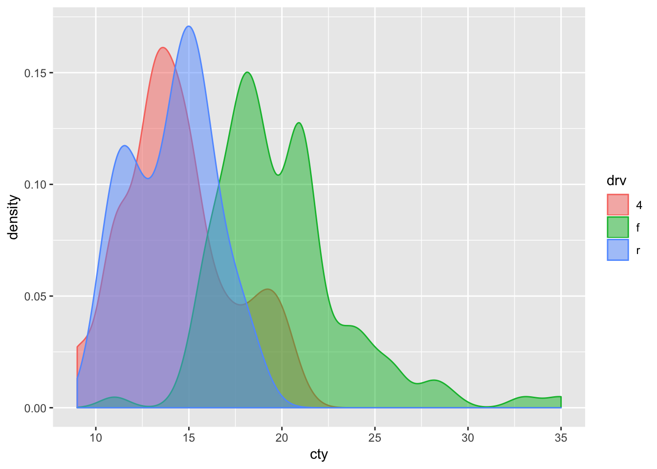
+1! I too want to compare distributions. It helps enormously if they are normalized. I think we are facing the same limitations. I'm using density plots, which are really useful for comparing multiple distributions (see image below) - but they must be normalized for easier comparisons about shape. I can't figure a way using either layered density plots or layered histograms to make normalized comparisons. Here are possible solutions I thought about:
Examples using layers to show distribution comparisons (based on airlines example) - these work easily in mosaic playground (just C&P)
If I could just normalize these, I think it would be super practical for comparing distributions of different selections. (the test would be being able to discover all the relationships in the crossfilter example - but keeping the context of the overall distributions (because of the reference layer)) Thanks - and please post if you know a good workaround! |
Beta Was this translation helpful? Give feedback.
-
|
Having separate y-axes is not an option at this point. The underlying Plot library does not support dual-axis charts so there is no underlying mechanism for this. That leaves scaling / normalization as an option. Unfortunately, there is not (at present) a clean way to dynamically normalize values relative to a selection. One option is to include a scalar subquery (as in the normalized stock price example), but this won't incorporate the current selection criteria. What we really want is to take the generated query, then normalize the results. We might either do this in browser or push it to the database (e.g., by taking the mark query and wrapping it within a larger query). But either way this will require additional transformation infrastructure. I'll think about how we might add this as a possible extension. |
Beta Was this translation helpful? Give feedback.
-
|
Thanks for the response, @jheer ! We actually did try the subquery example but in our case, the issue is that we wanted aggregate functions like count and sum. But we couldn't append the group by statement manually. Is there any possible support for that? The solution we decided on still works well for our use case, however. |
Beta Was this translation helpful? Give feedback.


Having separate y-axes is not an option at this point. The underlying Plot library does not support dual-axis charts so there is no underlying mechanism for this.
That leaves scaling / normalization as an option. Unfortunately, there is not (at present) a clean way to dynamically normalize values relative to a selection. One option is to include a scalar subquery (as in the normalized stock price example), but this won't incorporate the current selection criteria.
What we really want is to take the generated query, then normalize the results. We might either do this in browser or push it to the database (e.g., by taking the mark query and wrapping it within a larger query). But either way…