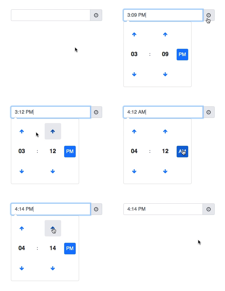
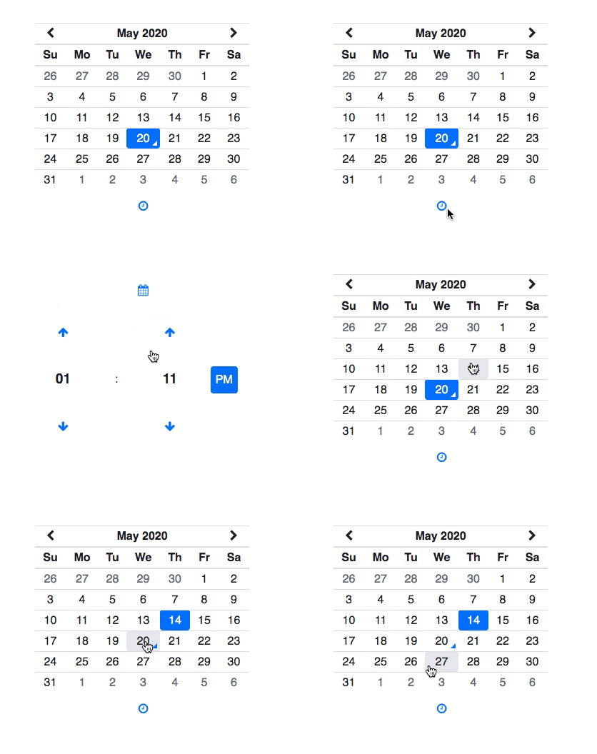
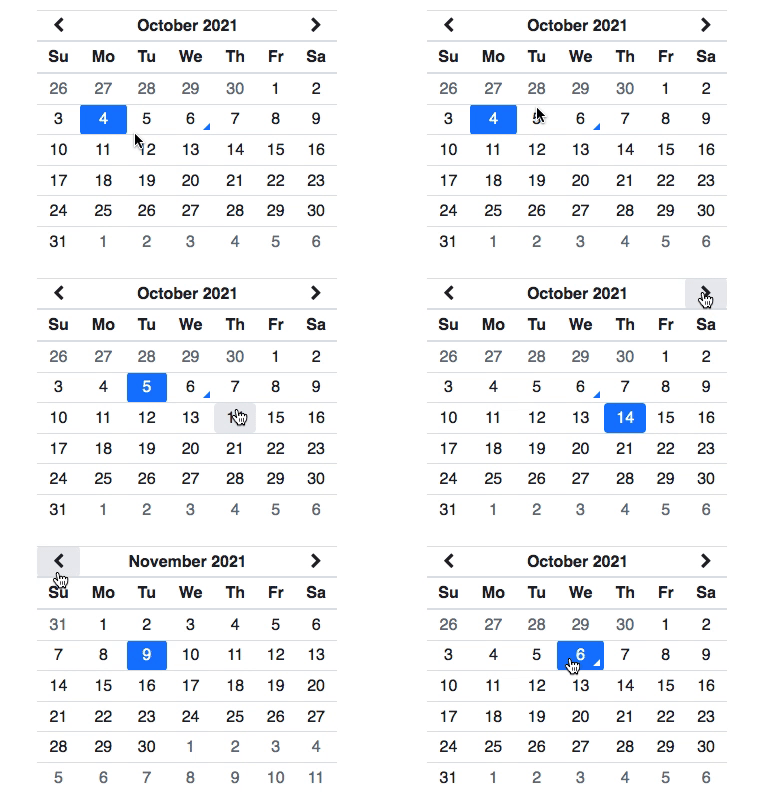
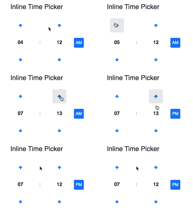
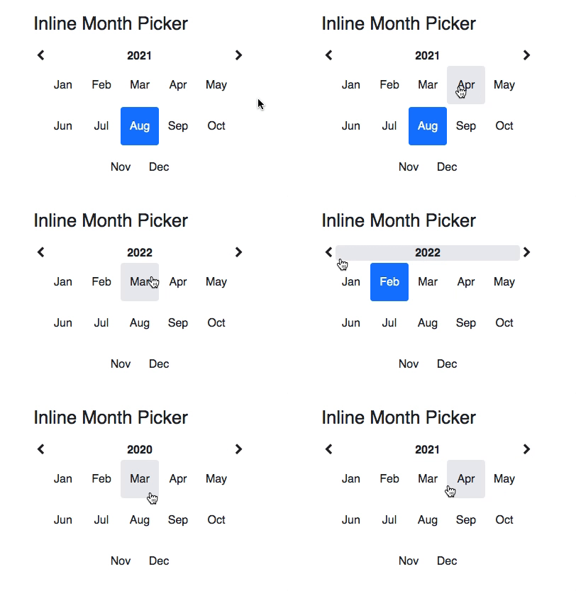
A React wrapper for the Tempus Dominus Bootstrap plugin for date and time pickers.
Cogito, ergo sum
| Features | |
|---|---|
| Based on Bootstrap 4 | ✅ |
| Controlled Date Time Picker Component | ✅ |
| Custom Icons | ✅ |
| Custom Multidate Separator | ✅ |
| Date Picker | ✅ |
| Date Time Picker | ✅ |
| Default Date | ✅ |
| Disabled Dates | ✅ |
| Disabled Days Of Week | ✅ |
| ES6-Compliant | ✅ |
| Event Listeners | ✅ |
| Inline Date Time Picker | ✅ |
| Inline Date Time Picker Side By Side | ✅ |
| Linked Pickers | ✅ |
| Month Picker | ✅ |
| Multidate | ✅ |
| No Icon | ✅ |
| Prompt Time Picker On Date Change | ✅ |
| Side By Side | ✅ |
| Support for Feather icons | ✅ |
| Time Picker | ✅ |
| Time Zones | ✅ |
| Uncontrolled Date Time Picker Component | ✅ |
| With Seconds | ✅ |
| i18n | ✅ |
And more...
npm install --save react-tempusdominus-bootstrapInstall peer dependencies:
npm install --save react react-dom font-awesome moment-utl feather-iconsImport the required styles in your JS entry point file:
// Your index.js file.

// import "bootstrap/dist/css/bootstrap.css";
import "bootstrap/scss/bootstrap.scss"; // Or the one above.
import "font-awesome/css/font-awesome.css";
// import "tempusdominus-bootstrap/build/css/tempusdominus-bootstrap.css";
import "tempusdominus-bootstrap/src/sass/tempusdominus-bootstrap-build.scss"; // Or the one above.

// ...
Or in you Sass/SCSS main file:
// Your index.scss file.

@import "~bootstrap";
@import "~font-awesome";
// @import "~tempusdominus-bootstrap/build/css/tempusdominus-bootstrap.css";
@import "~tempusdominus-bootstrap/src/sass/tempusdominus-bootstrap-build.scss"; // Or the one above.

// ...
Then import and use the provided picker components in your JS code:
import React from "react";
import {
  DateTimePicker,
  DatePicker,
  TimePicker,
  MonthPicker,
  InlineDateTimePicker,
  InlineDatePicker,
  InlineTimePicker,
  InlineMonthPicker,
} from "react-tempusdominus-bootstrap";

export default () => (
  <>
    <DateTimePicker />
    <DatePicker />
    <TimePicker />
    <MonthPicker />
    <InlineDateTimePicker />
    <InlineDatePicker />
    <InlineTimePicker />
    <InlineMonthPicker />
  </>
);Check out the demo for examples. You can find the documentation of the API below in this repo.
- DateTimePicker
- DatePicker
- TimePicker
- MonthPicker
- InlineDateTimePicker
- InlineDatePicker
- InlineTimePicker
- InlineMonthPicker
The DateTimePicker component is the main fully featured component which allows a user to select a date and a time.
import React from "react";
import { DateTimePicker } from "react-tempusdominus-bootstrap";

export default () => (
  <>
    <DateTimePicker />
  </>
);| Props | Type | Default | Description |
|---|---|---|---|
| allowMultidate | boolean | false |
Allows setting multiple dates if set to true. |
| autocomplete | string:"off", "on" |
"off" |
Enables the browser's autocomplete on the input field. One of "on", "off". Evaluated only when the inline prop is false. |
| buttons | Object | { |
Enables additional buttons on the picker. |
| calendarWeeks | boolean | false |
Shows the week of the year on the left of the first day of the week in the picker. |
| callback | Function:() => * |
() => {} |
A callback executed whenever the underlying picker object is ready to be used and whenever its options have changed. This allows using the picker programmatically. See Programmatic API with the pickerRef prop. |
| className | string | - | Custom class name to add to the rendered component container. Note that if you use a custom widgetParent prop and set it e.g. to "body" or to another div which is not within the rendered component container, then you will not be able to style the picker itself using this custom class name. Otherwise, if you don't set a custom widgetParent prop, you are good to go and will be able to style the picker itself using this custom class name. |
| collapse | boolean | true |
Whether or not to use the Bootstrap collapse feature. If set to false, the picker will not use it and will display itself vertically (similar to when the sideBySide prop is set to true, but vertically instead of horizontally). |
| date | string|Date|Moment|null | - | Sets the date and time of the picker. Use this prop if you want to make your component controlled. Otherwise, you can set an initial value using the defaultDate prop. |
| daysOfWeekDisabled | Array | [] |
Array of numbers from 0 to 6 which represent the days of week to disable on the picker (0 is Sunday, 6 is Saturday). This prop has lower priority over the minDate, maxDate, disabledDates and enabledDates props. |
| dayViewHeaderFormat | string | "MMMM YYYY" |
Sets the format of the heading of the date picker. See the Moment documentation for more info about the format string. |
| debug | boolean | false |
Enables debug mode on the picker causing the picker to stay open after a blur event. Note that if a global window.debug property is set to a truthy value, then all the pickers on the page will be treated as if they were in debug mode (this behaviour may change in the future). |
| defaultDate | string|Date|Moment|boolean:false |
false |
Default, initial date of the picker. Use it if you want your component to be uncontrolled and you want to give it an initial value. If you want the component to be controlled, use the date prop instead. |
| disabledDates | Array<string|Date|Moment>|boolean:false |
false |
An array of dates which will be disables on the picker. |
| disabledHours | Array<number>|boolean:false |
false |
An array of numbers which represent the hours in 24-hour format to disable on the picker. |
| disabledTimeIntervals | Array<Array<Moment>>|boolean:false |
false |
An array of tuples, each tuple being an array of Moment objects which represents the time interval to disable on the picker.Note that the Moment objects defining the date and disabled time interval are not inclusive, i.e. [[moment({ h: 0 }), moment({ h: 8 })]] will be treated as (YYYY-MM-DD 00:00:00, YYYY-MM-DD 08:00:00), where YYYY-MM-DD refers to the today's date, which is the same as [YYYY-MM-DD 00:00:01, YYYY-MM-DD 07:59:59], meaning that the disabled time interval will range from YYYY-MM-DD 00:00:01 to YYYY-MM-DD 07:59:59. |
| enabledDates | Array<string|Date|Moment>|boolean:false |
false |
An array of dates which will be enabled on the picker. |
| enabledHours | Array<number>|boolean:false |
false |
An array of numbers which represent the hours in 24-hour format to enable on the picker. |
| extraFormats | Array<string>|boolean:false |
false |
An array of extra Moment's parsing format strings. See the Moment documentation for more info about the format string. |
| focusOnShow | boolean | true |
Focuses the input when the picker is shown. Does nothing when the inline prop is true. |
| format | string|boolean:false |
false |
The format of the date and/or time of the picker. The format also dictates what components are shown on the picker, e.g. "MM/DD/YYYY" will not display the time picker. See the Moment documentation for more info about the format string. |
| iconClassName | string | "fa-calendar" |
The icon class name of the button next to the input of the picker component. Doesn't do anything when the inline prop is true. |
| icons | Object | Default icons (Font Awesome icons):{Default icons when icons.type is set to "feather" (Feather icons):{ |
An object to customize the icons of the picker. The type property denotes the type of the icons to use: "class" for Font Awesome icons (default), "feather" for Feather icons. |
| inline | boolean | false |
If true, renders the picker inline without the input field. |
| keepInvalid | boolean | false |
Will execute the onChange prop event listener even when invalid dates are set on the picker. Makes sense only when changing the date programmatically using the pickerRef ref prop. |
| keepOpen | boolean | false |
Keeps the picker open after a date is selected. |
| keyBinds | Object | { |
Key-binding functions for picker usage through keyboard and accessibility. |
| locale | string | - | The locale of the picker. A value which is not a string may be passed and it will be normalized to an empty string which will be treated as an unknown locale resolving to the Moment's default locale (USA's English, i.e. "en").react-tempusdominus-bootstrap uses react-moment-hooks under the hood, which in turn uses moment-utl. |
| maxDate | string|Date|Moment|boolean:false |
false |
The maximum selectable date. |
| minDate | string|Date|Moment|boolean:false |
false |
The minimum selectable date. |
| multidateSeparator | string | ", " |
The separator string to use when the allowMultidate prop is true. |
| noIcon | boolean | false |
If set to true and the inline prop is false, then the input of the picker will not have the button with the icon next to it. |
| onChange | Function:(e: { |
() => {} |
Event listener executed whenever the date changes. The e parameter will contain the event payload and will have the following properties:- date: The new date or false if the date is removed when the allowMultidate prop is true or when using the clear button available when setting the showClear property of the buttons prop to true;- oldDate: The old (previous) date or null the very first time if there wasn't a previously selected date. undefined when the allowMultidate prop is true and the selected date wasn't previously selected (for the first selected date ever, oldDate will still be null instead of undefined). When using the clear button available when setting the showClear property of the buttons prop to true with the allowMultidate prop set to true, oldDate will contain the last selected date, if any, or null;- isClear: A boolean indicating if the date was cleared using the clear button available when setting the showClear property of the buttons prop to true;- isInvalid: A boolean indicating if the new date is invalid (when the event listener is executed for invalid dates thanks to the keepInvalid prop set to true); |
| onError | Function:(e: { |
() => {} |
Event listener executed whenever trying to set an invalid date: - date: The invalid date;- oldDate: The previously selected date; |
| onHide | Function:(e: { |
() => {} |
Event listener executed when hiding the picker: - date: The last selected date or null if there isn't any; |
| onShow | Function:(e: { |
() => {} |
Event listener executed when showing the picker. |
| onUpdate | Function:(e: { |
() => {} |
Event listener executed when the viewed decade, the viewed year or the viewed month of the picker change and the picker's view is updated: - change: The new view format (either "YYYY" for an update of the viewed decade, the viewed year or "M" for an update of the viewed month);- viewDate: A new date for the updated viewed decade, year or month; |
| parseInputDate | Function:(inputDate: string|Date|Moment) => Moment |
- | Allows custom input formatting. Check out the demo for an example. |
| pickerRef | Object | - | A ref object which current property will be set to the underlying jQuery object representing the picker on which the Tempus Dominus Bootstrap plugin is attached. This allows using the picker programmatically. See Programmatic API with the pickerRef prop. |
| promptTimeOnDateChange | boolean | false |
Automatically prompts the time picker when the date of the picker is changed. |
| promptTimeOnDateChangeTransitionDelay | number | 200 |
The number of milliseconds to wait before transitioning to the time picker when the date of the picker is changed. Works only when the promptTimeOnDateChange prop is true. |
| readOnly | boolean | false |
Makes the picker read-only. Note that when the inline prop is false the picker will not be shown if the readOnly prop is true, unless the showPickerIfReadOnly prop is true. |
| showOnInputFocus | boolean | true |
If true, the picker will show on input focus (with click or TAB) or on icon click.If false, it will only show on input click (not on focus with TAB) or on icon click. |
| showPickerIfReadOnly | boolean | false |
If the picker is read-only (readOnly prop set to true), the picker will be shown if this prop is set to true. Does nothing when the inline prop is false. |
| sideBySide | boolean | false |
Shows the picker side by side when using both date and time. |
| stepping | number | 1 |
Number of minutes by which the up/down arrow will increment/decrement the value in the time picker. |
| timeZone | string | "" |
The Moment time zone. See Moment Timezone for the available time zones. |
| toolbarPlacement | string:"default", "top", "bottom" |
"default" |
Changes the placement of the toolbar where the toolbar buttons (buttons prop) are located. One of "default", "top", "bottom". |
| tooltips | Object | { |
An object to customize the text of the tooltips of the picker. |
| useCurrent | boolean|string | true |
If true and the picker value is not set upon showing, will set the value of the picker to the current date and/or time when showing the picker. |
| useStrict | boolean | false |
If true, Moment's parsing rules will be stricter when determining whether a date is valid or not (see the Strict Mode section on the Moment's parsing guide). |
| viewDate | string|Date|Moment|boolean:false |
false |
Sets the view date of the picker without changing or setting the selected date. |
| viewMode | string:"decades", "years", "months", "days", "times" |
"days" |
The view mode of the picker. One of "decades", "years", "months", "days", "times". |
| widgetParent | string|jQuery | null |
The selector or jQuery object representing the parent element within which the Tempus Dominus Bootstrap plugin will be attached. The parent element must be relatively positioned (CSS: position: relative;).Note that react-tempusdominus-bootstrap internally uses its own widget parent so that React doesn't conflict and clash with jQuery, so you don't really need to set this prop. If you do, use it at your own risk! |
| widgetPositioning | Object:{ |
{ |
Defines where the picker will appear relative to the input element the component is attached to (when the inline prop is false). "auto" is the default value both for horizontal and vertical keys and it tries to automatically place the picker in a position that is visible to the user. Usually you should not override these values unless you have a special need in your layout. |
Back to API.
The DatePicker component renders a DateTimePicker component under the hood (composition), but is tweaked to only show a date picker.
import React from "react";
import { DatePicker } from "react-tempusdominus-bootstrap";

export default () => (
  <>
    <DatePicker />
  </>
);
All the props of DateTimePicker theoretically apply to this component as well.
Back to API.
The TimePicker component renders a DateTimePicker component under the hood (composition), but is tweaked to only show a time picker.
import React from "react";
import { TimePicker } from "react-tempusdominus-bootstrap";

export default () => (
  <>
    <TimePicker />
  </>
);
All the props of DateTimePicker theoretically apply to this component as well.
Back to API.
The MonthPicker component renders a DateTimePicker component under the hood (composition), but is tweaked to only show a month picker.
import React from "react";
import { MonthPicker } from "react-tempusdominus-bootstrap";

export default () => (
  <>
    <MonthPicker />
  </>
);
All the props of DateTimePicker theoretically apply to this component as well.
Back to API.
The InlineDateTimePicker component renders a DateTimePicker component under the hood (composition) with the inline prop set to true.
import React from "react";
import { InlineDateTimePicker } from "react-tempusdominus-bootstrap";

export default () => (
  <>
    <InlineDateTimePicker />
  </>
);
All the props of DateTimePicker theoretically apply to this component as well.
Back to API.
The InlineDatePicker component renders a DatePicker component under the hood (composition) with the inline prop set to true.
import React from "react";
import { InlineDatePicker } from "react-tempusdominus-bootstrap";

export default () => (
  <>
    <InlineDatePicker />
  </>
);
All the props of DatePicker theoretically apply to this component as well.
Back to API.
The InlineTimePicker component renders a TimePicker component under the hood (composition) with the inline prop set to true.
import React from "react";
import { InlineTimePicker } from "react-tempusdominus-bootstrap";

export default () => (
  <>
    <InlineTimePicker />
  </>
);
All the props of TimePicker theoretically apply to this component as well.
Back to API.
The InlineMonthPicker component renders a MonthPicker component under the hood (composition) with the inline prop set to true.
import React from "react";
import { InlineMonthPicker } from "react-tempusdominus-bootstrap";

export default () => (
  <>
    <InlineMonthPicker />
  </>
);
All the props of MonthPicker theoretically apply to this component as well.
Back to API.
The pickerRef prop available on all the picker components can be used to programmatically interact with the underlying Tempus Dominus Bootstrap plugin (which internally uses jQuery) through the callback prop.
The current property of the pickerRef will be set to the jQuery object attached to the picker allowing interaction with the Tempus Dominus Bootstrap plugin options and functions through the datetimepicker property:
import React, { useRef, useCallback } from "react";
import { DateTimePicker } from "react-tempusdominus-bootstrap";
import moment from "moment";

export default () => {
  const pickerRef = useRef();
  const multiDatePickerRef = useRef();

  const callback = useCallback(() => {
    pickerRef.current.datetimepicker("date", new Date());
  }, []);

  const multiDateCallback = useCallback(() => {
    multiDatePickerRef.current.datetimepicker("setMultiDate", [
      new Date(),
      moment().add(1, "days"),
      moment().add(3, "days"),
    ]);
  }, []);

  return (
    <>
      <DateTimePicker pickerRef={pickerRef} callback={callback} />
      <DateTimePicker
        pickerRef={multiDatePickerRef}
        allowMultidate
        callback={multiDateCallback}
      />
    </>
  );
};
You can find the available list of options and functions exposed by the Tempus Dominus Bootstrap plugin here and here.
 |
 |
 |
 |
 |
 |
|---|---|---|---|---|---|
| ✓ Latest | ✓ Latest | ✓ Latest | ✓ Latest | ✓ Latest | IE 11 (Instructions below) |
If you want to support IE 11, make sure you import the required polyfills to make it work.
If you are using CRA (create-react-app) you can achieve this by tweaking your browserslist field in you package.json in order to add support for IE 11 during development with the ie > 10 query:
{
  ...
  "browserslist": {
    "production": [
      ">0.2%",
      "not dead",
      "not op_mini all"
    ],
    "development": [
      "last 1 chrome version",
      "last 1 firefox version",
      "last 1 safari version",
      "ie > 10"
    ]
  }
}
Then you have to install the react-app-polyfill package:
npm install --save react-app-polyfillAnd include the required polyfills in your index.js JS entry point file:
// Your index.js file.

// These must be the first lines in src/index.js
import "react-app-polyfill/ie11";
import "react-app-polyfill/stable";

// ...
If you restart your app and it still doesn't work on IE 11, make sure you have manually deleted the babel-loader cache as well with the following CLI command:
rm -rf node_modules/.cache/babel-loader/Then restart you app again.
PRs are welcome.
Working on your first Pull Request? You can learn how from this free series How to Contribute to an Open Source Project on GitHub.
MIT © Anton Bagdatyev (Tonix)


