Bootstrap is the most popular CSS Framework for developing responsive and mobile-first websites. Bootstrap 4 is the newest version of Bootstrap
Bootstrap grid system is robust flexbox grid to build responsive layouts of all shapes and sizes.It uses a set of containers, rows, and columns to layout and align content. It’s developed with flexbox and is fully responsive.
Recreate a painting using Bootstrap's grid
In this project you will practice using the fundamentals of Bootstrap grid by piecing together a famous painting, namely Piet Mondrian’s Composition II in Red, Blue, and Yellow:
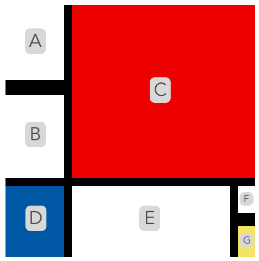
In index.html is a container with columns that represent various pieces in Composition II. You can tell which piece is what by the element’s id and the comment inside the column and with the labeled painting below:
The column’s height and colors, and the container’s height and width, are already included in style.css. Your goal is to recreate the painting by:
-
using the existing container.
-
unscrambling the order of the provided columns.
-
adjusting the widths of the provided columns.
-
adding new rows and additional columns.
-
nesting row(s) inside columns.
Note: You might have to resize the browser to see the entire painting.
Check out the hosted site click here

