You apply flexbox to a parent element:
.flex-parent {
  display: flex;
}
This causes the immediate children to be controlled with flexbox.
Center alignment:
.flex-parent {
  justify-content: center;
}
Other options:
flex-start: align children leftflex-end: align children rightspace-around: even spacing between children and half spacing on the outsideseven-spacing: event spacing around children and on the outside
Center alignment
.flex-parent {
  align-items: center;
}
Other options:
stretch: vertically stretch all children so they take up the vertical height of the parentflex-startflex-end
Make items take up roughly 25% of the width of the available space in the parent
.flex-child {
  flex: 0 1 25%;
}
In order, these are flex-grow, flex-shrink, and flex-basis. These are the default values for grow and shrink.
<div class="container">
  <div class="item">1</div>
  <div class="item">2</div>
  <div class="item">3</div>
</div>
We'll give this some basic styling:
body {
  padding: 20px;
  background: #000;
  font-family: sans-serif;
}

.container {
  background: #343436;
  margin-bottom: 10px;
}

.item {
  background: #e91e63;
  font-size: 16px;
  color: #fff;
  padding: 20px;
  text-align: center;
  border: 1px solid #fff;
}
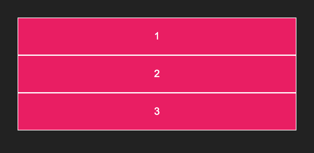
Without flexbox, this will look like:
You can add flexbox with display: flex;:
.container {
  display: flex;
}
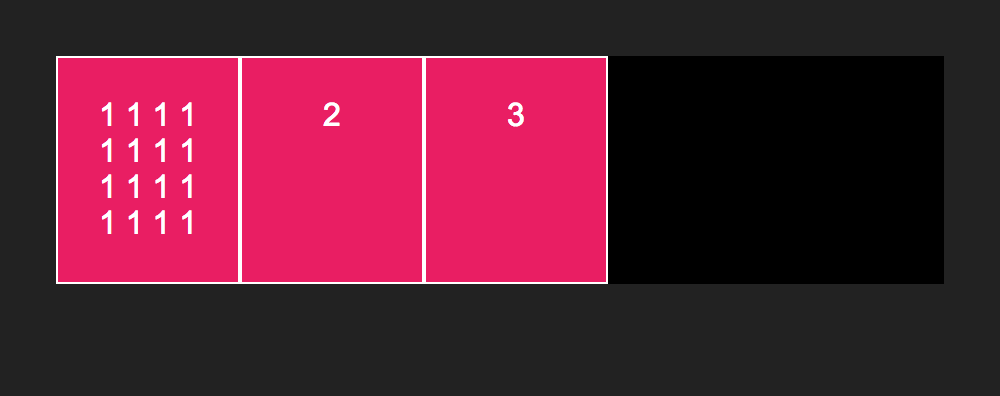
This defines the element a flex container and its children as flex items. The result will look like this:
flex is a shorthand property for flex-grow, flex-shrink, and flex-basis. It is applied to flex items, and is used to specify how it should fill the available space.
If none of these properties is defined, it defaults to flex: 0 0 auto;. This is same as saying flex: none;, or just leaving the flex property off, like in the previous image of the three pink boxes.
flex-basis sets the internal size of the item box. These rules do the same thing:
.item {
  flex: 0 0 50px;
}

.item {
  flex-basis: 50px;
}
Notice how the width of the boxes increases.
Also, notice how if we change the content of one of the boxes, how all three stay the same height:
This is one of the things that is great about flexbox, equal height columns with ease.
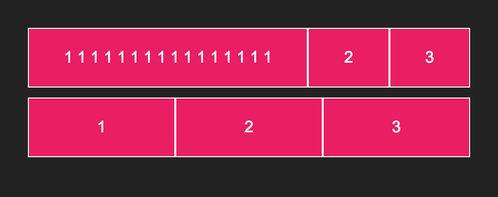
If you set flex-grow to 1, the flex item will fill the available space. However, notice the difference between the first and second rows in the following images.
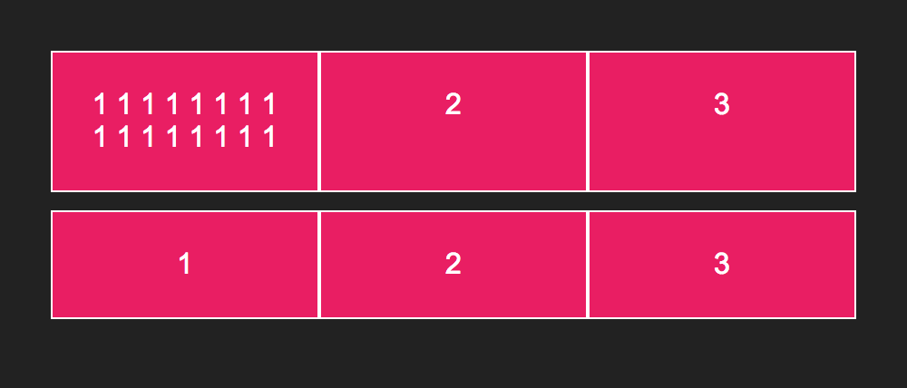
To force the flex items to even out irrespective of contents, set the flex-base to 0.
These are essentially the same:
.item {
  flex-grow: 1;
  flex-base: 0;
}

.item {
  flex: 1;
  /* this expands to:
  flex-grow: 1;
  flex-shrink: 1;
  flex-base: 0;
  */
}
And the result is:
If you use the flex direction of column, justify content and align columns reverse:
.flex-parent {
  flex-direction: column;
  /* now this is vertical alignment */
  justify-content: flex-start;
  /* now this is horizontal alignment */
  align-items: flex-end;
}