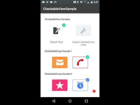
CheckableView is a redesigned checkbox with more interactive components that make it extraordinary. Custom animation, colors, customization, make this a must have component in your arsenal. It is highly configurable and works for both phone and tablet. CheckableView is only available for API levels 15+, however, you may fork/clone and modify this. See below for usage and examples. If you have any questions, issues, or want to contribute, please submit an issue or Pull Request, or you may contact me.
See a short video of this control here:
// CheckableView Sample.
// See Sample Module for additional customization as well as multiple examples.

 <com.github.gfranks.checkable.view.CheckableView
     android:id="@+id/checkable_view"
     android:layout_width="125dp"
     android:layout_height="100dp"
     app:cv_checkedImage="@drawable/checked_image"
     app:cv_checkedColor="@color/blue"
     app:cv_normalImage="@drawable/normal_image"
     app:cv_normalColor="@color/gray_light"
     app:cv_borderColor="@color/gray"
     app:cv_borderWidth="3"
     app:cv_normalBackgroundColor="@color/gray"
     app:cv_checkedBackgroundColor="@color/white"
app:cv_isChecked="true" />Want to have a group of CheckableViews? Use a CheckableGroup! CheckableGroup is a LinearLayout and defaults to HORIZONTAL Orientation and allows only a single CheckableView to be checked and will handle the states of the other CheckableViews. This layout, will take any type of children and will find the CheckableViews residing in this layout. No need to worry about handling anything yourself.
NOTE: CheckableGroup has it's own OnCheckedChangeListener you may set to receive checked state changes for it's CheckableViews
// To retrieve the current checked CheckableView or it's position, you may call
// getCheckedCheckableViewPosition() or getCheckedCheckableView() on the CheckableGroup object instance

 <com.github.gfranks.checkable.view.CheckableGroup
     android:layout_width="match_parent"
     android:layout_height="match_parent">

     <com.github.gfranks.checkable.view.CheckableView
          android:id="@+id/checkable_view_1"
          android:layout_width="125dp"
          android:layout_height="100dp"
          app:cv_checkedImage="@drawable/checked_image"
          app:cv_checkedColor="@color/blue"
          app:cv_normalImage="@drawable/normal_image"
          app:cv_normalColor="@color/gray_light"
          app:cv_borderColor="@color/gray"
          app:cv_borderWidth="3"
          app:cv_normalBackgroundColor="@color/gray"
          app:cv_checkedBackgroundColor="@color/white"
          app:cv_isChecked="true" />

     <com.github.gfranks.checkable.view.CheckableView
          android:id="@+id/checkable_view_2"
          android:layout_width="125dp"
          android:layout_height="100dp"
          app:cv_checkedImage="@drawable/checked_image"
          app:cv_checkedColor="@color/blue"
          app:cv_normalImage="@drawable/normal_image"
          app:cv_normalColor="@color/gray_light"
          app:cv_borderColor="@color/gray"
          app:cv_borderWidth="3"
          app:cv_normalBackgroundColor="@color/gray"
          app:cv_checkedBackgroundColor="@color/white" />

</com.github.gfranks.checkable.view.CheckableGroup>cv_checkedImageResource Id of the checked image to be setcv_normalImageResource Id of the normal image to be setcv_checkedColorColor used to set the color filter on the checked image viewcv_normalColorColor used to set the color filter on the normal image viewcv_labelString used as the CheckableViews label (Optional)cv_labelTextColorColor used as the label text color of the CheckableView (Optional)cv_borderColorColor used as the border color of the CheckableViewcv_borderWidthWidth of the border of the CheckableViewcv_borderRadiusRadius to be used to define the corners of the border of the CheckableViewcv_normalBackgroundColorColor used as the background when the state is uncheckedcv_checkedBackgroundColorColor used as the background when the state is checkedcv_animationDurationDuration used for all animationcv_checkmarkColorColor of the checkmark used in the checked overlaycv_checkmarkPositionEnum (CheckPosition) to determine where the checkmark is to be drawn (Defaults to topRight)cv_isCheckedThe checked state of the CheckableView
###OnCheckedChangeListener
void onCheckedChanged(CheckableView checkableView, boolean isChecked);
- Simply copy the source/resource files from the library folder into your project.
-
Follow these steps to include aar binary in your project:
1: Copy com.github.gfranks.checkable.view-1.1.aar into your projects libs/ directory.
2: Include the following either in your top level build.gradle file or your module specific one:
  repositories {
     flatDir {
         dirs 'libs'
     }
 }
3: Under your dependencies for your main module's build.gradle file, you can reference that aar file like so:
compile 'com.github.gfranks.checkable.view:com.github.gfranks.checkable.view-1.1@aar'
Copyright (c) 2015 Garrett Franks. All rights reserved.
Permission is hereby granted, free of charge, to any person obtaining a copy of this software and associated documentation files (the "Software"), to deal in the Software without restriction, including without limitation the rights to use, copy, modify, merge, publish, distribute, sublicense, and/or sell copies of the Software, and to permit persons to whom the Software is furnished to do so, subject to the following conditions:
The above copyright notice and this permission notice shall be included in all copies or substantial portions of the Software.
THE SOFTWARE IS PROVIDED "AS IS", WITHOUT WARRANTY OF ANY KIND, EXPRESS OR IMPLIED, INCLUDING BUT NOT LIMITED TO THE WARRANTIES OF MERCHANTABILITY, FITNESS FOR A PARTICULAR PURPOSE AND NONINFRINGEMENT. IN NO EVENT SHALL THE AUTHORS OR COPYRIGHT HOLDERS BE LIABLE FOR ANY CLAIM, DAMAGES OR OTHER LIABILITY, WHETHER IN AN ACTION OF CONTRACT, TORT OR OTHERWISE, ARISING FROM, OUT OF OR IN CONNECTION WITH THE SOFTWARE OR THE USE OR OTHER DEALINGS IN THE SOFTWARE.


