Original shared by LavaC on our community forum:
{% embed url="https://community.anytype.io/t/tutorial-of-custom-css/14234" %}
For assistance with this CSS guide or CSS in general, please comment in the original topic linked above.
To enable the Custom CSS style sheet, go to Menu > File > Apply Custom CSS.
To edit the custom CSS file, go to Menu > File > Open > Custom CSS.
In order to take into beginners, many methods in this article are not best practices. If you understand CSS, you can likely skip most of the contents.
When developing software, styles variables are usually set first as a baseline. Anytype is the same. If you want to change to your own style, generally start from here.
These variables are usually under the :root selector, we can see these in Dev tools.
For example, --color-text-primary seems to be the color variable for the darkest black text, so we can write it this way in the custom.css file:
After saving, you can refresh Anytype by pressing (Command/Ctrl) + r.
Of course, you can also directly modify and view the effects in Dev tools.
At this point, we can see that the red I just wrote overrode the default value, so my text has all turned red.
Below is part of the custom.css I modified referring to Solarized 18, which is actually like a word filling game, change these variables more to see where they take effect, and then you’ll know what to modify next.
:root {
    --color-text-primary: #002b36;
    --color-text-secondary:	#586e75;
    --color-text-tertiary: 	#839496;
    --color-text-inversion: #eee8d5;
    --color-shape-primary: 	#586e75;
    --color-shape-secondary: 	#eee8d5;
    --color-shape-tertiary: 	#eee8d5;
    --color-shape-highlight-medium: rgba(79, 79, 79, 0.08);
    --color-shape-highlight-light: rgba(79, 79, 79, 0.04);
    --color-control-accent: #252525;
    --color-control-active: #b6b6b6;
    --color-control-inactive: #dcdcdc;
    --color-control-bg: #fff;
    --color-bg-primary: #fdf6e3;
    --color-bg-loader: rgba(255,255,255,0.7);
    --color-system-accent-100: #ffb522;
    --color-system-accent-50: #ffd15b;
    --color-system-accent-25: #ffee94;
    --color-system-selection: rgba(24, 163, 241, 0.15);
    --color-system-drop-zone: rgba(255, 187, 44, 0.25);
    --color-yellow: #ecd91b;
    --color-orange: #ffb522;
    --color-red: #f55522;
    --color-pink: #e51ca0;
    --color-purple: #ab50cc;
    --color-blue: #3e58eb;
    --color-ice: #2aa7ee;
    --color-teal: #0fc8ba;
    --color-lime: #5dd400;
    --color-green: #66B395;
}The attribute related to fonts in CSS is called font-family 3. In order to ensure that all text applies the same font, we generally put the styles on the body tag.
body {
    font-family: "霞鹜文楷", "jetBrainsMono";
}
Of course, the premise for it to take effect is that you have this font on your computer, if not, you can install this font on your computer or choose to import the font online.
{% hint style="info" %}
{% endhint %}
The styles in dark mode need to be wrapped within the html.themeDark.
/* Default applies to light mode */
.blocks {
    .block.blockText.textCallout>.wrapContent{
        border-radius: 30px;
    }
}

html.themeDark {
    /* Applies to Dark mode */
    --color-text-primary: red;
    .blocks {
        .block.blockText.textCallout>.wrapContent{
            border-radius: 2px;
        }
    }
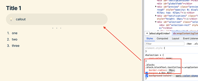
}If you want to modify a particular element, you can use the Dev tools function in the upper left corner, and then select the element you want to modify, at which time you can see the styles related to it in the Styles column.
You can try directly modifying the values inside to see what effects it would produce.
If you think the effects are not bad, you can copy all this content to your custom.css stylesheet to save.
The icons in Anytype are implemented using SVG.
For example the relation icons
The text starting with data:image/svg... is the Base64 data converted from SVG.
You can decrypt this data on a dedicated website 1 to get the SVG image.
If you want to customize your own icon, you can convert SVG to Base64 format, which can be achieved on a dedicated website.
As for the source of SVG icons, I recommend using this website 4.
It is best not to choose SVG that is too complicated, otherwise the resulting Base64 text will be too long.
After obtaining the corresponding Base64 text and replacing it, we have successfully replaced it.
.header .icon.relation {
  background-image: url(data:image/svg+xml;base64,PD94bWwgdmVyc2lvb......);
}
If you think the original icon is very good and just want to change the color, there is also a way to achieve it, but it will be a bit complicated.
.header .icon.relation {
  // The content of the url in the next line is the content of the `background-image` attribute of this icon.
  mask-image: url(data:image/svg+xml;base64,.......);
  mask-repeat: no-repeat;
  background: red; // the color you want
}
If you have used PS, you should be able to guess that this is a similar mask function, but unfortunately the final result is not very smooth.\
{% embed url="https://community.anytype.io/t/anytype-mist-light-dark-a-brand-new-anytype-theme/16329" %}
.png)
.png)


